This is not a video review. Although it may sound like it at times. This video is about how automation is changing the world today. There is a comparison to historical times and an explanation to why things are different today. The examples are very limited in scope but I for a short video like this one, they are impactful.
This video presents an ominous picture of the future. However, I agree with it more than I disagree. I work in the technology industry as a data analyst/data engineer and every month I am handed a project which involves the automation of some functionality. I am not even talking about the automation as explained in this video (machine learning). The automation I develop is simple code or by use of tools which eliminate the need for a human being to press a button or even open the file. It’s been two years and I have automated numerous such processes saving many hours or boring monotonous work. It’s after working on projects like this that I slowly start to realize that certain functions of my work can be automated too. (Chill runs down the spine).
The truth is, that there is no clear answer to the question: Will we all lose our jobs to the robots? .
People have ideas but they are untested. Tech companies do not even want to try to answer the question as they will fall behind the race to create the smartest machine in the world if they pause to ask this question. Governments seem to be oblivious to the problem and the alarming number of graduates taking up low skilled jobs doesn’t bother them; at least they have a job.
After watching the video, I went into a micro panic; I typed the following words in the YouTube search bar: FIGHT AGAINST AUTOMATION. The only videos I found were mostly media house produced videos about the very question I have mentioned above, news articles and university videos about how to IMPROVE automation (WTF!). There were no independent videos of people seriously thinking about the question. There was one video:
177 views + 1 (mine)
This was particularly scary for me because I thought that I would find tons of videos of YouTubers ranting against automation and thinking of ways to fight back to protect professions or atleast thinking of ideas to help people stay employed in the future but … nope. No angry YouTubers here. Only rich business owners talking about why their hands are tied:-
“I don’t want to do it but I have to do…nothing personal”
All this is not immediately worrying for me. I am a male with a master’s degree and technical skills sitting in front of a laptop. I order my food online. I am a beneficiary of this wave of automation which is sweeping the low skill work market. I cannot empathize with a server in a fast food joint or a worker in a grocery store. But in my own industry I have seen jobs disappearing. There was a time when software testers used to be in demand. I myself had thought of learning extensive software testing (in depth) in the past. But today, I rarely see any jobs for software testers. I do see automation engineering positions a lot though.
Conclusion:-
My fingers are tired. “Hey Google, can you please take this down for me? ”
We are benefiting from automation. But we are also blind to its pitfalls. The lack of voices out there screaming about the challenges automation poses to our collective future is alarming but this picture can be changed. And I think we are moving in the right direction. Although I am afraid our speed is slow.
First, we need to make the effects of automation known far and wide. The word is not out there yet. Also, we must realize that automation is not taking a bottom up approach. It’s is taking a bottom-up, top-down and middle-up-down approach, all at the same time. It is happening in all levels of the corporate hierarchy. So if you are reading this on your computer or mobile screen, start thinking about how this can impact you and your future.
The objective,is to build a model which is able to predict if a particular station will run out of bikes within two hours. If the model is able to predict this with reasonable accuracy, it is possible for the bike sharing company to replenish the station with more bikes.
If a station requires bikes, an alert message can be sent to a central command center which can then dispatch a truck/vehicle carrying more bikes to replenish the station which sent the alert.
Since there are a number of stations, the model has been built on the station with the highest traffic. It can then be applied to all the other stations or to high volume stations if required.
Data Set Information:-
The data set includes the following files.
Station.csv : Contains station information like name, location and number of docks available (70 rows)
Status.csv: This is sensor data for every minute for each station. It shows the number of bikes available at the station at that minute (72 M records)
 > station_id
 > Bikes_available
 > Docks_available
 > Time
trip.csv: Contains trip related information for each station (670K Rows)
weather.csv: Contains weather related data for each day for each zip code (3665 rows)
The data set is quiet large (approximately 660MB), which is why its a good data set to experiment with pyspark. Because I have worked on a single machine instead of a cluster, I have used basic pyspark here to read and extract the data.
Remark on Data Quality:- The data quality was generally good. However, the time stamps were inconsistent in a few places. The weather data also had some incorrect values in columns which were handled.
Methodology
Approach
We begin by combining the data as the relevant information is present in a number of different data sets. The station table contains station information which acts as a key to identify station specific data from the status table and the trip table.
Why just one station ?
Since the data set is a large one, and not all stations have similar traffic, we identify the one station where we can check our methodology. Eventually, we can apply the same methodology to other stations.
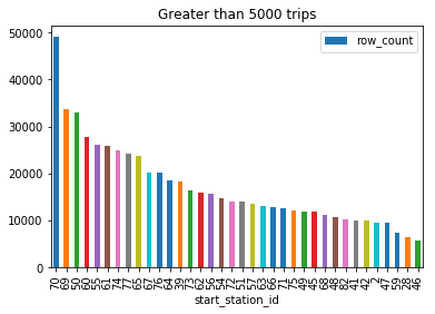
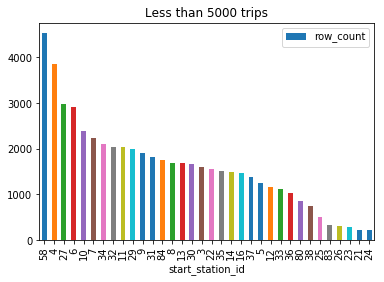
Station 70 has significantly higher number of trips than any other station A large number of stations have less than 5000 trips over the time period (2013-2015)
Since every station has different amounts of traffic, I haven’t explored a strategy where all the station data is taken together, however this can be done if we have a cluster of machines or multiple nodes. But I believe the best approach will be to take the highest volume stations together and the lowest volume stations separately. In low volume stations, maybe such a prediction may not work.
Building the parameter which will be predicted
A parameter called Replenish is introduced. This parameter is set to 0 (which means that the station does not require additional bikes at them moment), based on the available number of bikes in the station. If the available number of bikes is less than 4, then the parameter is set to 1, which means that the station needs additional bikes.
The parameter has been created by looking forward in time by 1 hour for our historic data set. If in the next one hour, the number of cycles available is less than or equal to 4, the flag is set as 1. If it is greater than 4, the flag is set as 0. This number (4 in our case) can be modified based on:-
Station and number of customers using the station
Traffic at that hour of day
Since we have historical data (and we can look forward an hour), and a practical application of this would probably be in real time data, the parameter will have to be built differently in that case. Some considerations are:-
Traffic volume for the time stamp based on historical values
Historic number of available bikes at the time stamp – also considering time/day/month – similar to our parameter
Forecasting: We can conduct a simple forecasting trying to predict the number of bikes available at the hour of the day. Initially this forecasting will be done to check its accuracy. If it is fairly accurate, we can build a model based on it.
Note: This forecasting can be continuously improved over time even if its not accurate initially, by replacing the forecast with actual data.
Once the forecast is accurate enough, our model accuracy will improve as well.
Data Import and Cleaning
There were some issues with the timestamp formats in the data which have been handled in the code Apart from that, the data was relatively clean and did not require extensive manipulations.
Exploratory Data Analysis using Data Vizualizations
Exploratory data analysis has been done by using the following packages:-
matplotlib for graphs and charts related to the predictive models
seaborn for exploratory data analysis
matplotlib has been used more extensively as seaborn resulted in slower rendering of the graphs because of the size of the dataset. Below are some of the visualizations done based on the data set available. They give us a fair idea of the traffic on station 70 through out the time period.
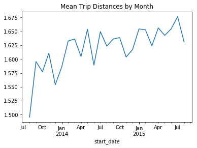
Trip distances show an overall increasing trend throughout the time period suggesting that the number of users is growing
Monthly distances clearly show an increasing trend. Notice the drops in the months around January and July which are the coldest and warmest months of the year suggesting the drop in active users during these months
Weekly trip distances show a more detailed picture.
Apart from trip distances, number of trips have also been explored. The mean trip durations have also been explored for the data. Seasonality can be observed in the data for all these observations.
I
It’s interesting to notice that the trip durations during the months of July and January are the highest. Which is a strange observation because the trip distances were low during these months. This may suggest users not returning their cycles for long periods of time on the same trip. They might be staying indoors for long periods of times.
The above conclusion can be verified based on weekly numbers. Notice the spikes for January and July
Number of trips show drops only for winter months.
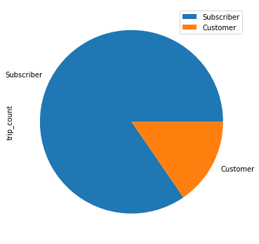
Subscriber are the ones who make the majority of trips.
Understanding the Traffic
Understanding the traffic patterns is important in feature building. Traffic is the key element of our data set and it will be used to build features which will help us predict whether the docking station needs additional bikes or not.
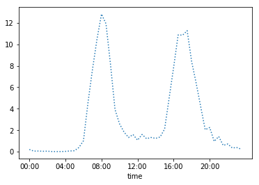
Below is a graph which shows the net number of bikes at any given time on the docking station 70. The number of bikes in play have been totalled and we have calculated the mean across the time period and plotted it against the time of the day. This clearly shows which time periods have the highest and lowest traffic.
Y-axis: Net number of bikes in play It is clear that traffic is the highest around 8.00 AM in mornings and 5.00 PM.
It is evident that the traffic peaks in the mornings and evenings. This suggests:-
A large number of people leaving and coming in during the morning (around 8.00 AM) and evening (around 5.00 PM) hours.
The traffic pattern suggests the docking station is in an area which has both residences and offices.
This also tells us that these hours are the time when the docking station will need replenishment the most frequently.
Below, we have done a similar analysis for traffic for the day of the week. 0 being a Monday and 6 being a Sunday. There are no surprises here. The traffic peaks on Wednesday’s and drops sharply on the weekend.
Weekdays (0 – Monday, 6 – Sunday)
Based on the analysis above, additional features were developed in order to take these factors into consideration. For example:-
net_incoming_overall_by_hour: This feature gets the mean of the net incoming traffic (no. of incoming bikes – no. of outgoing bikes), by hour of the day. The mean is taken across the complete data set for each hour of the day.
net_incoming_overall_by_weekday: Similar to the above feature except instead of hour of the day, the day of the week is considered.
net_incoming_traffic_ratio_1: Ratio of the mean of the net incoming traffic in the last 24 hrs vs the net_incoming_overall_by_hour for the specific hour.
net_incoming_traffic_ratio_2: Ratio of the mean of the net incoming traffic in the last 24 hrs vs the net_incoming_overall_by_weekday for the specific weekday
With these features, we aim to consider these factors within our data model.
Machine Learning Models
Since I have structured this as a classification problem after time series analysis, I chose the following models. These are the most commonly used classification models and having passed the datasets to them, I have compared the results with each other to identify the best model.
K-Nearest Neighbours
Decision Tree Classification
Random Forest
Model Evaluation
Model evaluation is done based on the following parameters:-
Accuracy
ROC curve
Precision
Recall
Accuracy of the models is important in this scenario along with precision and recall. Our aim is to minimize false positives (precision) and false negatives (recall) while also having a high accuracy.
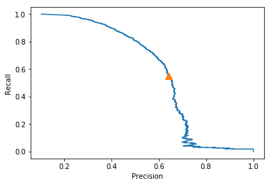
Precision-Recall Curves:-
kNN Precision Recall Curve
The precision recall curves have been displayed here. It can be seen that the precision-recall for kNN is definitely better than that of the decision trees model. Although decision trees has a higher recall value, kNN outscores it as far as precision is concerned, which is more important for out case.
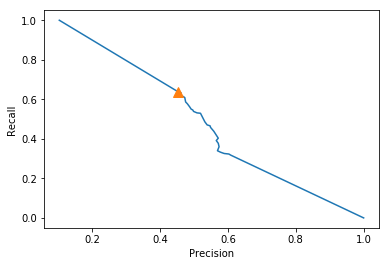
Decision Trees: Precision Recall Curve
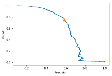
Below is the precision recall curve for the random forest classifier. We can see that it is more balanced that the previous two models. It has a higher precision that decision trees and a higher recall than both decision trees and kNN.
One key objective is to reduce the number of false negatives as much as possible. To achieve this, different probability thresholds have been tried for different models. The best one is identified based on the the minimum number of false positives and false negatives. False positives can be tolerated (to an extent) because that would mean providing additional cycles to a station when they are not actually needed. However, a scenario where this happens is more acceptable than losing customers to other competitors in case our stations do not have cycles for the customers.
Model Name
False +ve (1 as 0)
False -ve (0 as 1)
Model Accuracy
kNN
334
485
91.3%
DT
831
394
88%
RF
575
270
91.4%
As far as the false positives and false negatives are concerned, its upto the business to decide which factor is more important. False positives mean 1 classified as 0. In this scenario, it would mean a replenishment flag (station needs additional bikes) classified as a no flag (station does not need bikes). This may result in loss of customers as they will find no bikes in the station.
However, is this opportunity cost higher than the cost of sending bikes to a location when the docking station has a sufficient number of bikes (false negative – 0 classified as 1) ? Maybe the cost of transporting bikes and then leaving without replenishing the bikes or waiting at the station for docks to be empty, is higher than losing a customer ?
This is a question for another analysis if we have other data, like the opportunity cost or cost to replenish a bike on the station.
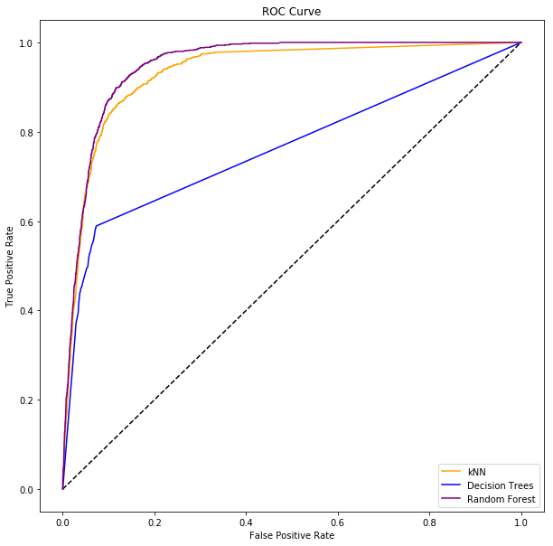
ROC curve for all three models
Based on the ROC curve, we can conclude that the Random Forest model is the best for our scenario. It covers the most area under the curve. kNN is not far behind either. Perhaps, if we want to reduce the number of False Positives, kNN is the better model.
Assumptions and Limitations
This is my first attempt at working on a relatively complex time series data set. In the past, I have seen time series data which have been analysed to identify trends and patterns. However, predictions with time series data is new. In order for the target variable to be available, we will have to forecast incoming and outgoing traffic which can be done fairly easily on a time series data set. Our target variable can then be used to predict where bicycles will be needed.
Assumptions
There are many assumptions in this case:-
The forecasts for the bycycle traffic need to be fairly accuate. This is possible with the data available to us. More data can possibly make it more accurate to figure it out.
The dock sensors, which identify whether a bicycle has been taken out of the dock are fairly accurate, fast (sending data instantaniously) and reliable (low failure or error rates)
For our model building, I have assumed the minimum number of bicycles which trigger the flag as 4. This number can be changed though.
Limitations
Our target variable depends on forecasts. If an unseen event or change in traffic effects the forecast, our target variable also gets effected.
There is much more data which can be gathered regarding the docs and customers or subscribers. This can help in building a better model but is not available to us. For example, if we have subscriber data, we can forecast with great accuracy which subscribers are likely to take a bike and this helps in traffic predition.
Conclusion and Client Recommendation
As a consultant working with the client, my recommendation, based on the analysis would be to use the Random Forest model in order to most accurately predict the when the station will need replenishment of bicycles. This recommendation has been reached based on the different metrics used to measure model performance.
The Random Forest model results in the highest accuracy and the lowest false positive and false negative rates which we are trying to reduce.
The Random Forest model is also ideal for data sets with mixed features.
The model can be exposed as a web application in which similar data sets can be passed to obtain results however, the best way to use it would be to train any new data set.
I would recommend the client to use similar modelling for all the other station data available. This model would be best suitable for the stations with the highest traffic.
Future Research
Including subscriber data along with dock status and traffic information
Combining all station data and running on a cluster(s)
Building a live dashboard based on the incoming data – or a dashboard based on available data
Application layer
An application can be built which can let us manipulate parameters (like bicycle threshold/ subscriber information/ special events – like holidays etc. )
The application layer will enable us to change the predictions on the go if we are able to base our prediction on a movable window of time.
An application layer which checks in real time the accuracy of our forecast and allows for changes to tweak it.
Applications in other similar industries
Apart from bike sharing, similar algorithms and methods can be used in other crowd-sharing scenarios like scooter sharing, equipment and services rentals, etc.